Restaurant Operations · Updated 2026-09-21 · 7 min
Menu Typography and Readability: Sizes, Contrast and Spacing That Work
Menu typography is a service decision, not a decoration decision. Guests read your menu at a distance and in light you do not control — standing at a counter, holding a phone in a dim dining room, or scanning a board across a room. The rules that matter are measurable: type size against real viewing distance, contrast between text and background, line length, spacing between items and prices, and how many type styles you ask the guest to decode. Get those right and the menu feels calm. Get them wrong and guests order the item they can read fastest, which is rarely the one you want to sell.
Try the menu description generator
Readability is a service issue
A menu that is hard to read produces three costs. Guests ask more questions, which pulls staff away from service. They default to familiar items, which flattens the mix. And they misread prices, which creates friction at the till.
None of these problems look like design problems in the moment, which is why readability is often fixed late. It is cheaper to test a proof with a phone and a tape measure before printing than to reprint a menu that guests quietly avoid.
Type size by viewing distance
Type size only means something relative to distance. The practical starting points below are ranges to test, not regulations; your lighting, paper and audience will move them.
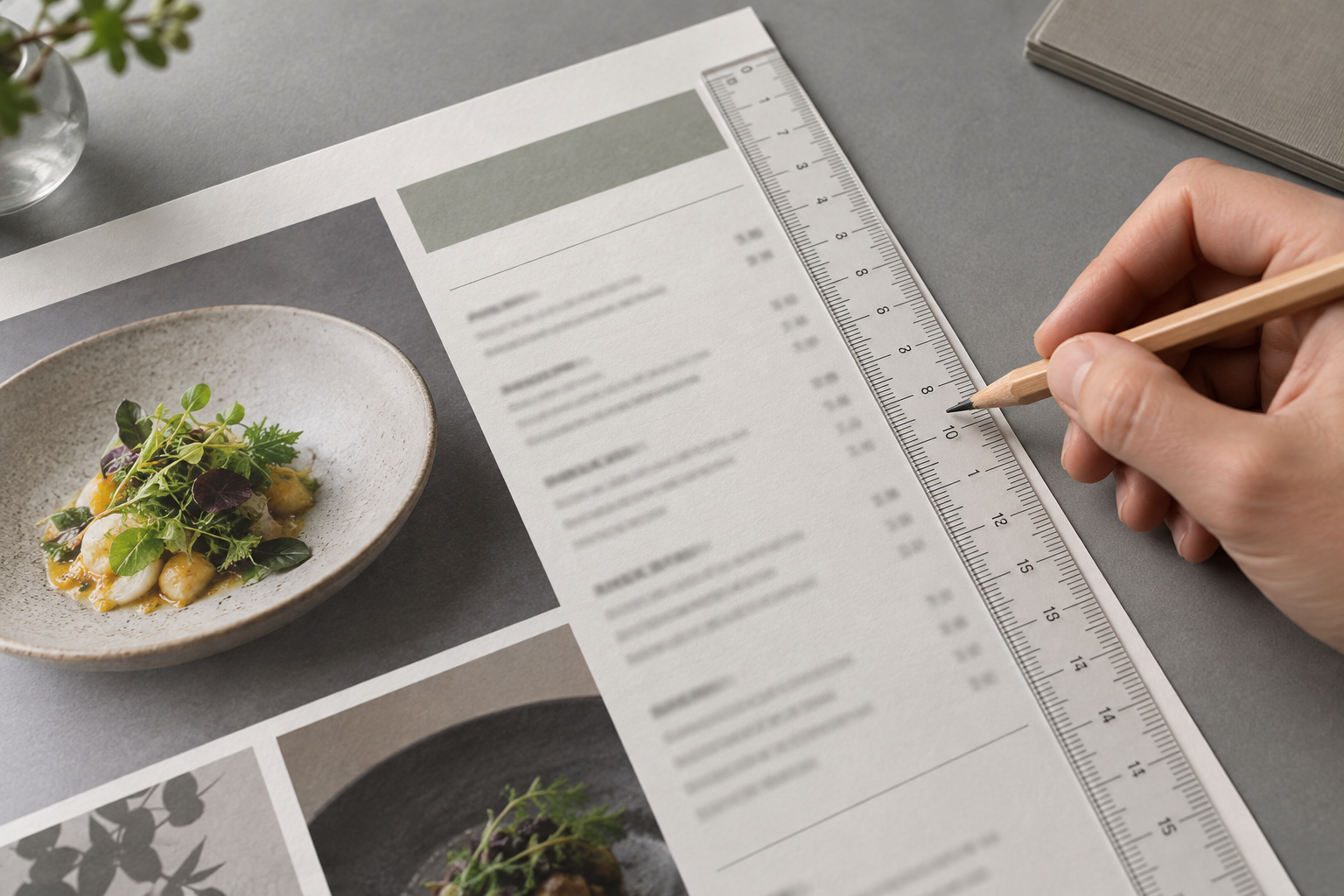
Measure your own menu at its real distance rather than trusting a rule. Stand where the guest stands, hold the proof, and read one full item aloud without leaning in. If you cannot, the type is too small for that position.
- **Printed menu held in the hand:** body text around 10 to 12 points, prices the same size as the item name or slightly larger. Below 9 points, older guests and anyone reading in low light will struggle.
- **Table menu at arm's length:** 12 to 14 points for descriptions, with section headings clearly larger.
- **Counter or wall board read from two to three metres:** item names at least 25 to 35 millimetres tall, with the price as large as the name.
- **Menu board read from five metres or more:** 50 millimetres and up, with fewer items per line and heavier weight.
Contrast, not colour preference
Contrast is what makes text readable; colour is what makes it on-brand. The two are not the same, and dark-on-dark or light-on-light palettes fail regardless of how good they look on a screen.
A practical test: convert your menu to greyscale. If the text and the background become similar greys, the contrast is too low. Warm off-white paper with dark ink, or dark boards with white text, usually work. Pale grey on cream, gold on beige and thin white text over a photograph rarely do.
Photographic backgrounds are the most common failure. If a photo must sit behind text, keep the text in a solid or heavily darkened area, and test it at the size guests will actually read.
Line length, spacing and alignment
Three layout habits do most of the work.
- **Keep description lines short.** A comfortable line holds roughly 45 to 75 characters; longer lines make the eye lose its place when it returns to the left margin. If your descriptions wrap across a wide page, shorten the copy or narrow the column.
- **Separate items clearly.** A guest should never have to work out which price belongs to which dish. Consistent spacing between items, and a slightly larger gap between groups, does that without rules and boxes everywhere.
- **Align prices consistently.** Right-aligned prices in a column let guests scan a whole section in one pass. Prices placed after a long description, or centred in a ragged line, force them to read every word. Dot leaders can help on a wide page, but only if they are subtle and consistent.
Script and decorative fonts
Decorative fonts are fine for a restaurant name, a section heading or a single accent word. They are poor for item names, descriptions, prices and allergen notes, because letterforms that look elegant at display size become ambiguous at text size — especially letters like a, e, r and n in a cursive face.
A reliable structure is two fonts and three sizes: one display font for the identity, one clean text font for everything else, and a clear hierarchy of section heading, item name and description. Every additional style asks the guest to do work.
The phone test before you print
Before you commit to a print run, run the same check you would run on a QR menu. Photograph the printed proof with a phone at the distance a guest will hold it, then look at the photo at normal size. Small type and low contrast show up immediately in a photograph, even when they look acceptable in your hand.
Then check the screen version separately. A QR menu is read on a narrow column, often with the phone held closer than a printed page. Body text should be comfortably large, tap targets should be generous, and a guest should not need to pinch or zoom. If the hosted menu is a PDF, the same test applies: a full-size page shrunk to a phone screen is not a mobile menu.
Worked example: a printed lunch menu
The numbers below are illustrative.
A lunch menu is printed on A4 at 9-point body text with 8-point prices. In a dim room, guests over fifty ask servers to read items aloud, and two of the lowest-volume dishes are never ordered.
The rework keeps the same content and changes four things: body text to 11 points, prices to 11 points right-aligned in a column, description lines shortened to under 70 characters, and the pale grey accents replaced with dark ink. Section headings drop from four styles to two.
The menu now runs to two pages instead of one. The trade is accepted because the second page is a section guests order from, not filler. In the weeks after, questions at the table drop and the two quiet dishes start appearing in orders.
Limitations and assumptions
These guidelines assume guests read the menu themselves; where staff read the menu aloud as a service, size matters less and clarity of names matters more. They assume reasonable lighting and reasonable eyesight, with no allowance for specific visual impairments — large-print menus and staff assistance should be available separately. Brand constraints, print substrate, ink colours and display hardware all shift the result, and no font choice guarantees readability on its own. Treat every number here as a starting point to test with your own guests, not as a standard.
FAQ
What is the minimum font size for a restaurant menu?
For a hand-held printed menu, treat 10 points as a practical floor for body text and go larger for older audiences or low-light rooms. For wall and counter boards, think in viewing distance rather than points. Test the proof at the real distance; if you have to lean in, it is too small.
Are script fonts always a bad idea?
Not always, but they belong to the identity, not the information. Use a script for the restaurant name or a section accent if it fits the brand, and keep item names, descriptions, prices and allergen notes in a clean text face. If a guest has to decode a letter, the font is doing the wrong job.
Should I use photos behind text on a menu?
Only with a solid or heavily darkened area behind the words. Photos behind text are the most common cause of unreadable menus, especially on phones where the image is compressed and the screen is bright. If the photo is important, give it its own space and keep the text on a clean background.
Build your menu
Turn the ideas in this guide into a hosted QR and print menu with MenuCrafters.