Restaurant Operations · Updated 2026-07-30 · 12 min
Restaurant Menu Photos: When to Use Them and When to Skip Them
Use restaurant menu photos when an image explains something that names and descriptions cannot show easily, the photographed dish reliably matches what is served, and the team can keep the image current. Skip photos when the item is already familiar, plating changes often, the available images are inconsistent, or pictures would make the format harder to scan. Most restaurants do not need an all-photo or no-photo rule: a selective policy is usually the more workable choice. Decide dish by dish, then adjust the presentation for print, QR, online ordering and digital displays.
Try the menu description generator
The four-part Menu Photo Policy Matrix
Use this matrix as an internal decision aid, not as a validated predictor of sales or customer behaviour. Score each candidate dish **low, medium or high** on four dimensions. Do not add the ratings into a numerical total; the pattern matters more than a false-precision score.
| Dimension | Low | Medium | High | |---|---|---|---| | **Customer unfamiliarity** | The intended audience is likely to recognise the item and serving format from its name. | The name is familiar, but the preparation or format may not be. | The name, ingredients or serving format may be difficult to picture without help. | | **Visual distinctiveness** | The dish looks similar to other items or the photo adds little beyond the description. | One visible feature helps distinguish it. | Shape, assembly, colour, vessel or presentation conveys information that is awkward to express concisely. | | **Image fidelity** | Portion, garnish, plating or vessel varies enough that one image could misrepresent normal service. | The core dish is stable, with some controlled variation. | The team can reproduce the photographed portion and presentation during ordinary service. | | **Update burden** | The item and its presentation are stable, and an owner is available to maintain the asset. | Occasional changes require a planned review. | Ingredients, plating, availability or format change often, or no one owns updates. |
“High” means something different in the last two rows: high fidelity favours a photo, while high update burden argues against one. Apply these action rules:
Treat “signature”, “popular” or “high-margin” as nomination reasons, not automatic approval. A commercially important dish still needs a representative image and a workable update process. Conversely, an unfamiliar side dish might deserve a photo if its format is genuinely hard to explain.
- **Photo:** unfamiliarity or visual distinctiveness is medium/high, fidelity is high, and update burden is low/medium.
- **Text-only:** both unfamiliarity and distinctiveness are low, or fidelity is low, or update burden is high with no credible maintenance owner.
- **Limited pilot:** the image could clarify the dish, but fidelity, placement or maintenance remains uncertain. Use it for one controlled channel or a small set of items, then review observable issues rather than assuming an outcome.
Add the channel overlay
A dish-level decision does not dictate identical treatment everywhere. Record the core action first, then apply the relevant channel constraint.
| Channel | Main constraint | Practical overlay | |---|---|---| | **Print menu** | Fixed space, final reproduction and a longer replacement cycle | Reserve images for dishes that remain stable. Review the proof at actual output size and check that crops, detail and contrast survive printing. Do not shrink descriptions merely to force in another photo. | | **Hosted QR or mobile menu** | Small screens, scrolling and varying connections | Use a consistent crop system, keep essential names, prices and descriptions readable without depending on the image, and test the published page on real phones under less-than-ideal connectivity. | | **Online ordering** | Repeated cards or thumbnails and close comparison between items | Keep framing consistent between comparable dishes. Check each thumbnail at its rendered size; an image that works as a large feature may become meaningless when reduced. Preserve text that identifies included items and choices. | | **Digital display** | Viewing distance, screen ratio and limited attention | Preview on the actual display from realistic customer positions. Prefer a few legible images over dense rows of small ones, and keep critical item information independent of fine photographic detail. |
This overlay can produce different outcomes for the same dish. A stable, distinctive platter might receive a prominent mobile image, one carefully sized print image and no place on a distant display where the crop is unreadable. That is a coherent policy, not inconsistency.
Example: a hypothetical neighbourhood lunch menu
This example is fictional and demonstrates the method; it is not a customer case study or a performance test.
A small lunch restaurant is considering photos for four items:
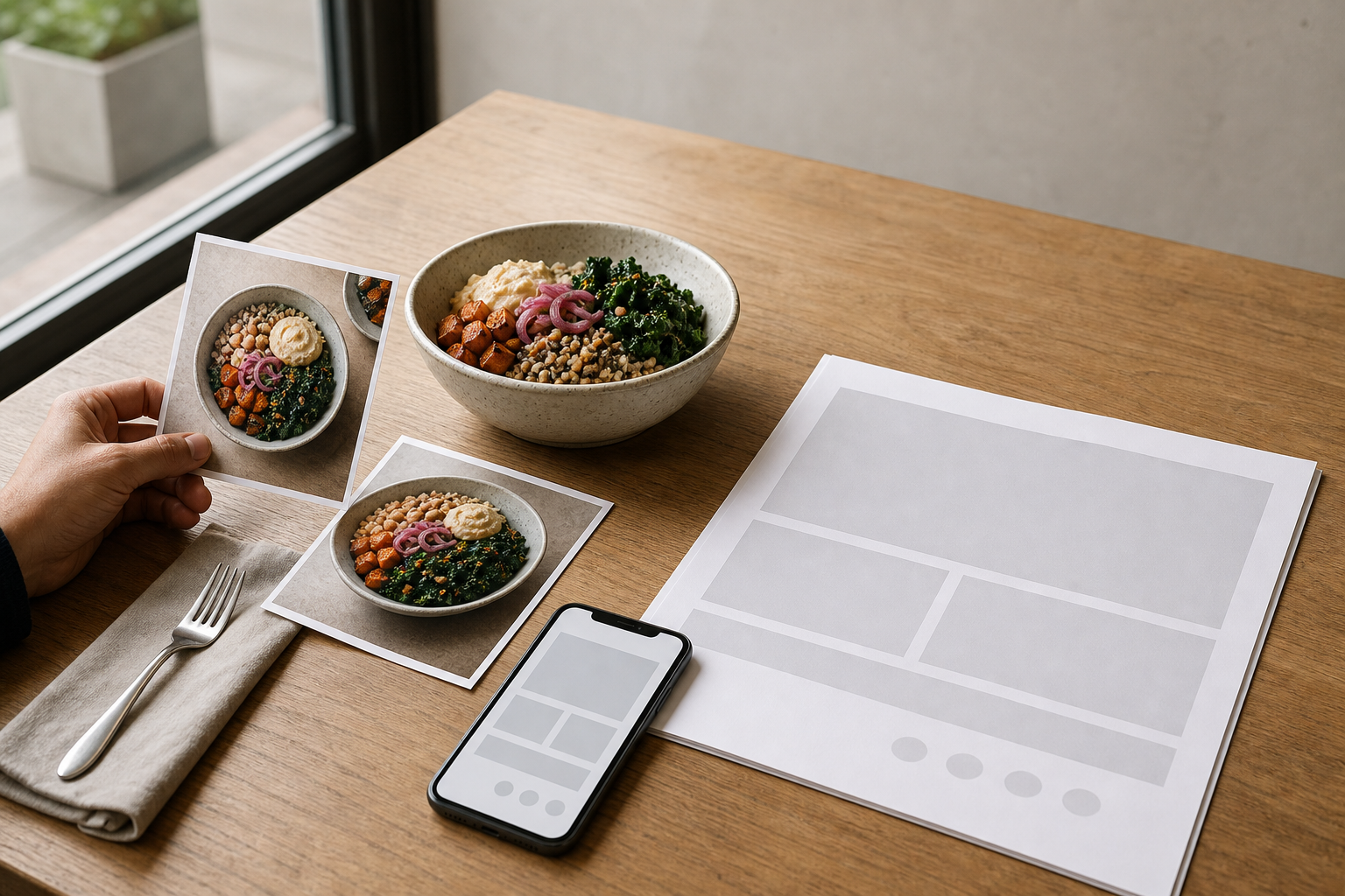
1. **House grain bowl:** the components are named, but its layered presentation is distinctive. Plating follows a standard assembly and changes only with a planned seasonal revision. Ratings: unfamiliarity medium; distinctiveness high; fidelity high; update burden medium. **Action: photo.** Use one representative image on the mobile menu and consider a single print feature if the crop remains useful at final size. 2. **Tomato soup:** the item is familiar and looks similar to many other soups. Garnish changes according to availability. Ratings: unfamiliarity low; distinctiveness low; fidelity medium; update burden medium. **Action: text-only.** A precise description can state the preparation and accompaniments without consuming image space. 3. **Daily open sandwich:** toppings, bread and plating depend on the day’s supply. The item can look distinctive, but no single image represents the rotating version. Ratings: unfamiliarity medium; distinctiveness high; fidelity low; update burden high. **Action: text-only.** If the restaurant later creates a stable version, reassess it as a new candidate rather than retaining an outdated image. 4. **Shared baked dish in a table pan:** the serving format may be unfamiliar and its scale is hard to convey in a short name. The vessel and portion are standard, but the team has not tested a usable mobile crop. Ratings: unfamiliarity high; distinctiveness high; fidelity high; update burden low. **Action: limited pilot.** Publish it in the hosted menu first, inspect it across phones and ask staff to log recurring questions about portion and format. The review concerns clarity and accuracy; it does not assume the photo will change sales.
The result is a selective policy with one approved photo, two text-only items and one controlled pilot. More importantly, every decision has a reason that a manager, photographer or designer can revisit later.
When text-only is the better design
Choose text-only when the menu cannot sustain visual fidelity. This commonly applies to daily specials, market-dependent preparations, chef-led menus with frequent revisions, or operations without a consistent image library. It also applies when available pictures differ noticeably in lighting, angle, background, crop or plating.
Do not replace a missing dish image with generic stock food photography. It cannot document what the kitchen serves. If original photography is not ready, improve the item name and description instead: identify the main ingredient, preparation, defining accompaniment and serving format, while keeping every detail accurate.
A no-photo menu still needs visual hierarchy. Use clear sections, restrained typography, predictable price placement and enough spacing to separate choices. Photography should not compensate for weak organisation, and removing photos should not leave an undifferentiated wall of text.
Implementation steps: from shortlist to policy
1. **Inventory every existing image.** Link each file to a current menu item and label its capture date, crop variants and owner. Quarantine images that cannot be matched confidently. 2. **Nominate candidates.** Start with items that are unfamiliar, visually distinctive or repeatedly difficult to explain. Do not promise that nomination will improve sales. 3. **Complete the matrix.** Have someone from kitchen or service review fidelity and update burden; these are operational judgements, not purely design choices. 4. **Set a photo standard.** Define the normal serving portion, vessel, camera angle, background family, lighting approach and crop ratios. The standard should reflect ordinary service rather than a one-off styling version. 5. **Assign one of three actions.** Record photo, text-only or limited pilot beside each dish, plus the reasoning and review date. 6. **Prepare channel variants.** Crop from an approved master rather than improvising a different composition for every format. Keep names, prices, dietary information and descriptions available as text. 7. **Review in context.** Check phones, printed proofs and installed displays where applicable. Look for awkward crops, excess scrolling, illegible detail, visual inconsistency and images that displace essential information. 8. **Publish with ownership.** Name the person responsible for replacing or removing an image. Add review triggers rather than relying only on a calendar.
If you need one editable source for menu structure and subsequent output, [MenuCrafters](https://menucrafters.com/) supports editable menus, hosted QR links and print-ready PDFs. Photography still requires its own capture, approval and maintenance process; the product signal supplied for this guide does not establish a photography service.
Pre-publish and maintenance checklist
Copy this checklist into the menu handover document.
Before publishing.
Replace or remove an image when.
Removal is a valid maintenance action. It is better to return an item to text-only than preserve a misleading photo for visual completeness.
- [ ] The image shows the dish as it is normally portioned, plated and served.
- [ ] Current ingredients, garnish, vessel and accompaniments agree with the item description.
- [ ] The restaurant owns or has permission to use the image.
- [ ] Lighting, angle, background and colour treatment fit the approved image set.
- [ ] Crop ratios are consistent within each repeated menu component.
- [ ] Names, prices and necessary item details remain readable without interpreting the image.
- [ ] Mobile pages have been reviewed on more than one real screen and under a constrained connection.
- [ ] Thumbnails have been inspected at their actual rendered size.
- [ ] Print proofs have been reviewed at final dimensions, not only enlarged on screen.
- [ ] Digital displays have been checked on the installed screen from realistic viewing positions.
- [ ] One owner and a next review date are recorded for every published image.
- [ ] The portion, recipe, garnish, vessel or plating changes materially.
- [ ] An item becomes unavailable or is replaced.
- [ ] A crop hides the feature the image was meant to explain.
- [ ] Staff identify a repeated mismatch between image and normal service.
- [ ] The file no longer works adequately in a live channel.
- [ ] No one can confirm that the image remains representative.
Limitations and trade-offs
The matrix is first-party editorial guidance, not a validated scoring model. Its categories organise judgement; they do not forecast revenue, conversion, order value or customer preference. Different audiences may recognise the same dish differently, so “unfamiliarity” needs local knowledge and periodic review.
A photograph cannot communicate every relevant detail. It may not show hidden ingredients, preparation, allergens, substitutions or exact scale, and it should never replace accurate written information or staff procedures. Colour and perceived quality can also vary across screens, lighting conditions and printed output.
A limited pilot can reveal crop failures, maintenance problems and recurring questions, but it does not establish causation. Ordering patterns can change for many reasons, and this guide provides no experimental design or benchmark. Restaurants that lack rights-cleared, representative images or a named maintenance owner should prefer text-only presentation until those gaps are resolved.
FAQ
Should every restaurant menu item have a photo?
No. Use photos selectively where they add information and can remain representative. Familiar items, frequently changing dishes and items with unstable plating are often better served by accurate text.
Are photos better for QR menus than for print menus?
Not automatically. A hosted mobile menu can accommodate flexible layouts, but images add scrolling and must work across screen sizes and connections. Print has fixed space and reproduction constraints. Apply the same dish policy, then adapt it to each channel.
What if a dish is visually impressive but changes every week?
Visual distinctiveness supports a photo, but high update burden and low fidelity override it. Keep the item text-only unless the team can capture, approve and replace the image whenever the served version changes.
Can stock photography fill gaps in a menu?
Not if it depicts food that is not the actual dish. Use a text-led layout until a representative, rights-cleared image is available. Decorative imagery should never imply that it documents a specific menu item.
How many photos should a menu contain?
There is no universal number. Approve images dish by dish, then check whether the combined set preserves hierarchy, readability and maintainability in each channel. If several approved images compete for limited space, prioritise those with the clearest explanatory role.
How often should menu photos be reviewed?
Use both a scheduled review and event-based triggers. Recheck an image when the recipe, portion, garnish, vessel, availability, crop or menu format changes. Remove it if nobody can confirm that it still represents normal service.
Build your menu
Turn the ideas in this guide into a hosted QR and print menu with MenuCrafters.
Open the AI menu builder